


Feedback report for ‘All Works Plastic Surgery’ stationary pack.
I presented my collection of products for a plastic surgeon I named “All Works Plastic Surgery” for review and critique to my class and teacher on the Thursday 13th may.
The following are their remarks and comments that were made by the teachers and other classmates.
• There was a discussion about the fonts I used throughout my work, some said that it was
“un-professional” and I should look in to changing it to a more clinical font. However other’s agreed that it was not clinically professional but thought it was personal without losing the professional look and that it was good but worth investigating further. As the brochure had brides-to-be in mind when they are getting ready for the wedding’s I am going for a friendly and personal look without losing the professional feel to it and I think the font I have does that.
• A comment the teacher made about my type was “when on to a good thing it does not have to be really big”. So I have been through all the text in my brochure and re-worked my text size and orientation. I think it is now to a point where the form meets the function nicely. Making it more inviting and less abrupt and in your face.
• I have however looked into fonts that may do this better but I am still really happy with the one I have, the look and feel I was going for and it still has a good form and functions the way I want it to. I understand where some of the class was coming from but I feel it fits what I was going for. As the teacher did not comment either way on what he thinks, I have since talked to the teacher about the text and we have worked on it and I’m much happier with where it is now. I have revised the sizing and spacing throughout my collections of works, as was suggested and I have greatly improved my works by doing this.
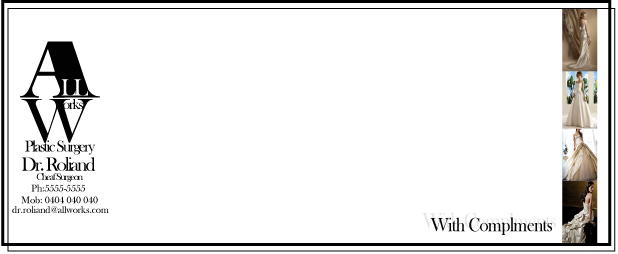
• One classmate commented on the With Compliments slip, she said, “get rid of everything on the left hand side of it”. There was a resounding agreement from the teacher so I have minimalist the whole thing. Getting rid of the water marked background. I have rearranged it and I am very happy I did. I have dragged it back to a simple and clean looking document that looks professional and friendly. Which is what I have been trying to get throughout the package.
I have also taken that feeling throughout my package, getting rid of all the un-necessary objects. Simplifying each piece giving it this professional yet friendly look and feel.
• My B-card was commented on, I had “head Surgeon” under the name of the surgeon. This caused some confusion, asking what a “head” surgeon was. I explained I meant the leading surgeon. Chief surgeon was suggested, I have changed it to “chief surgeon” instead of head.
• With the letterhead the biggest comment that stood out to me was that it looked like a website. This was not meant in a good way. So I have totally reworked it, keeping in theme with the rest of the package I have changed the colours I used and got rid of a lot of the un-necessary objects. Cleaning it up by only having the logo at the top and having all the other information at the bottom of the page
• There was no comment on the colours I used, so I am taking it as a good sign, however I have rethought them and I have chosen to go with a white or off white paper, for me worked giving it a bit of class that I feel was lacking when I used the pink.
• There was little to no discussion about my logo, however I have worked on it and minimalised it right back keeping in theme with the rest of the package and I think it looks much better for it. Getting rid of the girls in the background only staying with the type logo. I think it is more flexible and professional.
• From the feedback I got I have reworked the text in my package, I have kept the font but I have worked on the layout, size and spacing on the text, doing so has helped me make the text look more as a design element then just some words. I have been able to get the text working with the photos better giving the brochure a better flow, balancing out the text against the photos.
• I have entrusted a new photographic element throughout the body of work. I found a nice way of using the photos in the brochure, bookmark and with complements slip that gave them that something they really needed.
• I have added a border to all but the brochure in the package. I feel this gave them more of a uniformed look adding to the professional but friendly feel I have been going for. I chose not to add it to the brochure to give it a bit of difference and I don’t want it to look like all the other stationary, I want it to stand out and be a bit special.
I have come a long way with this package, moving from cheap and nasty to a very nice crisp clean and NOT wrecked group of works. I feel that this exercise has shown me not to get too excited when on to a good thing “just because its good does not mean it has to be BIG”. Colour can be a very powerful tool that can swing both ways making it work or totally fail.


