Monday, June 21, 2010

The Shelf


p-1
It was a lovely day in Melanie’s bedroom.
A perfect day for a tea party.
p-2
Sally some1 the doll and Belkira the soldier were just getting into place when Melanie’s mother called her away.


p-3
How disappointing, Sally thought to herself. She was looking forward to the tea party. Now she has to wait for Melanie.
p-4
Just then Sally heard a funny noise, as she looked around she saw it was Beltira on the shelf.


p-5
He was laughing so loudly and pointing at his sister, Belkira, sitting right next to Sally.
p-6
Sally could not see what was so funny, so she asked him.


p-7
“Beltira what is so funny? Why are you laughing at Belkira”?
p-8
Belkira does not want her brother to tell, but what can she do? She thinks her friends are going to laugh at her.


p-9
Beltira was laughing to hard it was hard to talk.
‘Belkira does not like pink, and look what Melanie dresses her in”!
p-10
This was a big surprise to Sally and the other toys from the shelf. How can you not like a colour?


p-11
Sally stood up and asked Belkira “Is it true? How can you not like a colour”?
p-12
Belkira looked at her dress and replied “It’s not all colours, I just don’t like Pink. Do you not like colours”?


p-13
Sally had not thought about it before, what colours does she like? Are there colours that she doesn’t like?
p-14
“I like Blue, pink, yellow and red, like my dress I really like Green. But now that I think about it I don’t like brown”.


p-15
Sally was thinking about colours and how different toys like different things and said “I guess we are all different and like different things. It makes us all special”.
p-16
Just then Melanie came back into the room, to continue with her tea party with Sally and Belkira.


My illustrated pages.


The shelf, Colour
Written and illustrated By Hayley Blonde.
My book in amid at a young children, 3 to 5 years of age. I have used simple and to the point sentences to encourage the young person to try to read but also to encourage imaginations this is a perfect bedtime story. I used a very simple front to follow throw with the idea i want think kids to use there imagination i don't want the taxt getting in the way of that. With fun characters, soothing colours and a lesson to be loaned.

The topic of this book is Colour, I have tried to explore the idea that not every one like every colour and that it is ok if you don’t like what others likes. I believe I have achieved this by opening a dialogue about colour. One toy trying to keep a secret that she dues not like pink as she thinks the others are going to laugh at her. Instead of being laughed at she challenges the others to think about what they like and they see that its not a bad thing to be different. It’s what makes them all special.

My characters are not you cliché toy that you would find in a little girls room. I have faceless toy solders, a toy scarecrow with her mouth sown up. A duck with a bendy neck. The only toy that you might find in a girls room is a patched up old teddy bear, but even he has no mouth. As I was looking in to children’s books and toys I found a theory on encouraging young children to use there imagination by what there toys book and characters they are exposed to and what they look like. They say that giving kids toys with no faces little to no details but use a small range of colour on each toy. Although I don’t agree with all of what I had found out about them. I liked the idea of simplifying right down, using simple shapes and little details through the book and illustrations.

I had some problems with getting the orientation right on some of my pages. But I think I found a nice medium with getting the character looking the way I wanted them to and being in the right position or looking in the light direction.

I have the characters looking at the reader a lot this is an attempt of drawing the reader in to the story , getting them more involved with what is going on in Melanie’s bedroom. I think it worked almost as I wanted it to. I am currently exploring this idea further.

Monday, May 31, 2010

Control Vs Chaos


Control

Hell

Dissonance

Chaos

Haven

Harmony

Tuesday, May 18, 2010

CUFDIG304A


Feedback report for ‘All Works Plastic Surgery’ stationary pack.

I presented my collection of products for a plastic surgeon I named “All Works Plastic Surgery” for review and critique to my class and teacher on the Thursday 13th may.
The following are their remarks and comments that were made by the teachers and other classmates.
• There was a discussion about the fonts I used throughout my work, some said that it was
“un-professional” and I should look in to changing it to a more clinical font. However other’s agreed that it was not clinically professional but thought it was personal without losing the professional look and that it was good but worth investigating further. As the brochure had brides-to-be in mind when they are getting ready for the wedding’s I am going for a friendly and personal look without losing the professional feel to it and I think the font I have does that.

• A comment the teacher made about my type was “when on to a good thing it does not have to be really big”. So I have been through all the text in my brochure and re-worked my text size and orientation. I think it is now to a point where the form meets the function nicely. Making it more inviting and less abrupt and in your face.

• I have however looked into fonts that may do this better but I am still really happy with the one I have, the look and feel I was going for and it still has a good form and functions the way I want it to. I understand where some of the class was coming from but I feel it fits what I was going for. As the teacher did not comment either way on what he thinks, I have since talked to the teacher about the text and we have worked on it and I’m much happier with where it is now. I have revised the sizing and spacing throughout my collections of works, as was suggested and I have greatly improved my works by doing this.

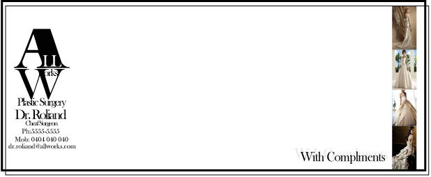
• One classmate commented on the With Compliments slip, she said, “get rid of everything on the left hand side of it”. There was a resounding agreement from the teacher so I have minimalist the whole thing. Getting rid of the water marked background. I have rearranged it and I am very happy I did. I have dragged it back to a simple and clean looking document that looks professional and friendly. Which is what I have been trying to get throughout the package.
I have also taken that feeling throughout my package, getting rid of all the un-necessary objects. Simplifying each piece giving it this professional yet friendly look and feel.

• My B-card was commented on, I had “head Surgeon” under the name of the surgeon. This caused some confusion, asking what a “head” surgeon was. I explained I meant the leading surgeon. Chief surgeon was suggested, I have changed it to “chief surgeon” instead of head.

• With the letterhead the biggest comment that stood out to me was that it looked like a website. This was not meant in a good way. So I have totally reworked it, keeping in theme with the rest of the package I have changed the colours I used and got rid of a lot of the un-necessary objects. Cleaning it up by only having the logo at the top and having all the other information at the bottom of the page

• There was no comment on the colours I used, so I am taking it as a good sign, however I have rethought them and I have chosen to go with a white or off white paper, for me worked giving it a bit of class that I feel was lacking when I used the pink.

• There was little to no discussion about my logo, however I have worked on it and minimalised it right back keeping in theme with the rest of the package and I think it looks much better for it. Getting rid of the girls in the background only staying with the type logo. I think it is more flexible and professional.

• From the feedback I got I have reworked the text in my package, I have kept the font but I have worked on the layout, size and spacing on the text, doing so has helped me make the text look more as a design element then just some words. I have been able to get the text working with the photos better giving the brochure a better flow, balancing out the text against the photos.

• I have entrusted a new photographic element throughout the body of work. I found a nice way of using the photos in the brochure, bookmark and with complements slip that gave them that something they really needed.

• I have added a border to all but the brochure in the package. I feel this gave them more of a uniformed look adding to the professional but friendly feel I have been going for. I chose not to add it to the brochure to give it a bit of difference and I don’t want it to look like all the other stationary, I want it to stand out and be a bit special.

I have come a long way with this package, moving from cheap and nasty to a very nice crisp clean and NOT wrecked group of works. I feel that this exercise has shown me not to get too excited when on to a good thing “just because its good does not mean it has to be BIG”. Colour can be a very powerful tool that can swing both ways making it work or totally fail.

Monday, May 10, 2010

All works Plastic surgery


Brochure inside

brochure outside


Logo

With compliments slip

Letter head


Book mark

Business card (front)

Business card (back)

CUFDIG303A-1-Blonde,H


Wednesday, May 5, 2010

the tuch ups

From some teach gidents i have re-worked some of my Logo hear are the final resolts


I made this one much for simple. using diffract fonts and only using 2 instruments on woodwind incited of the 4 i had. I also used different colours.

this one i played with different layout and colours

The only thing i needed to change was the font for Turners


I just tiddys this one up a bit

This one i took my idea and simplified it right down to this. I liked it

this one I have in to two different colours becouse i like the oringe but it may look a little bit like a tv program


cleand it ups up

played with the coloures


made it more bloky

Tuesday, May 4, 2010

oooops

So i thought the project was a fashion parried, but i was wrong its a modeling comp.
I have one comp and 3 praised.

I really enjoy this poster. i love the way the colours come together. I think it fits the look thaty model and fashionable people would pay attention to.

As a fashion show flyer go's i really like this one i think it would get the attenchion of the people i want to come to the event. i love the way the coloures in the text and colours in the image just fit.

I think I went a little over bord with the vines. But I with a little more development this one could be a really great poster/flyer.

This one is very symple compered to the other flyers. But i like it. i like the colours agents the black and white grafeety in the back ground.